Some of the logos and other graphics I have created for projects and clients.


Woot.

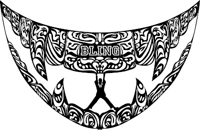
This illustration was created for a Washington Times editorial that discussed the potential self-destructive behavior promoted in rap culture and how it directly opposed Martin Luther King Jr.'s ideas of racial equality.
It was called "Banish the Bling"

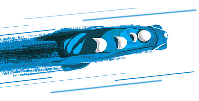
This was an illustration for the Torino Winter Olypmics. If you can tell, the trail of the sled is made entirely of words. Yes, it took me hours, and yes, those are all REAL olympic words... that I typed... one at a time.


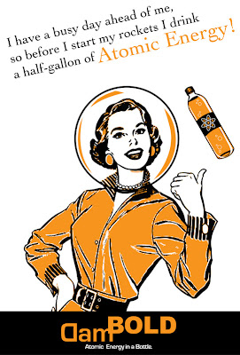
This was an ad I created for an energy drink named after myself. I decided to go 100% retro and borrowed my mom and grandmother's old TIME and LIFE magazines and looked at all of the ads.
I created these ads from that.
I didn't create the illustration on the first ad, but I did add the helmet and color. I also created the drink bottle.
I used a classic astronaut illustration as a base an drew EVERYTHING in illustrator. Everything. The file was about 80 megs. Took forever to load. Each star IS individually placed.

1 comment:
...ha,ah..now that you said,make more sense:but by myself I didný figure it out!Maybe is also because of my poor english skills!But i like it the classical art-nouveau like logo for Louisiana:easy to read,pleasureable(exist this word?)for eye:)
Post a Comment